
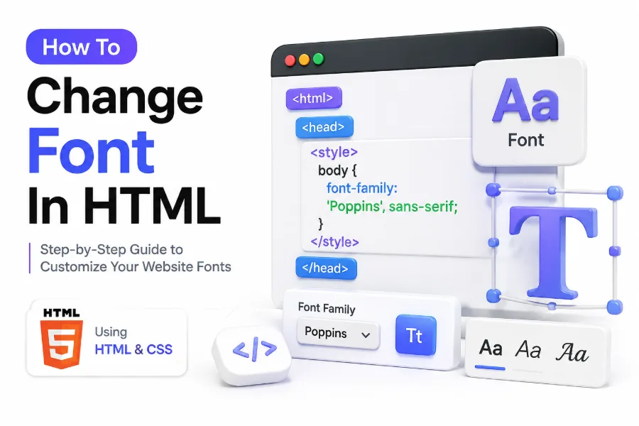
When you first start building web pages, one of the earliest design changes you will want to make is the text style. Default browser fonts often look plain, and they rarely match the tone of a brand, portfolio, or business website. That is why many beginners search for how to change font in html as soon as they begin editing a page.
Changing fonts in HTML is not difficult, but doing it well takes more than adding a quick style rule. You need to know where fonts should be controlled, which methods are outdated, how CSS works with HTML, and how to keep text readable across devices. A good font choice improves appearance, supports usability, and helps visitors stay on the page longer. In this article, you will learn the correct ways to change fonts in HTML, when to use each method, and how to avoid common mistakes that can make your page look inconsistent or hard to read.
Why Fonts Matter in HTML Design
Fonts shape the overall feel of a web page before a reader even starts reading the text itself. A clean sans-serif font can make a site feel modern, while a serif font can create a more formal and editorial tone. Typography quietly influences credibility and readability.
Good font styling also improves how users move through your content. Headings, body text, buttons, and navigation all depend on clear visual hierarchy. When fonts are chosen and applied properly, visitors can scan information faster and understand the page structure with less effort.
How HTML and CSS Work Together for Font Styling
HTML gives your page structure by defining elements like headings, paragraphs, lists, and links. CSS controls how those elements look, including color, spacing, alignment, and font appearance. If you want reliable font styling, CSS is the tool that should handle it.
Many beginners assume HTML alone controls fonts, but modern web design separates content from presentation. That is why learning how to connect CSS to HTML is essential. Once you style fonts with CSS, you can keep your design consistent across the entire page or website.
Quick font styling checklist
- Use CSS instead of outdated HTML font tags
- Apply one font for body text and one for headings when needed
- Always include fallback fonts in the font-family list
- Keep body text readable on desktop and mobile
- Test your font choices in more than one browser
Using Inline CSS to Change Font in HTML
One simple way to change a font is by adding an inline style directly inside an HTML element. For example, you can style a paragraph or heading with a font-family property. This method is easy for testing, quick edits, or learning how CSS rules affect specific text blocks.
The downside is that inline CSS becomes difficult to manage as your page grows. If every paragraph uses its own style attribute, editing the design later takes more time. Inline styling works for small examples, but it is not the best long-term solution for clean website development.
Example of Inline Font Styling
If you want one heading to use a different font, you can place the font-family property inside the element. A basic example would be a heading styled with Arial, Georgia, or Verdana. This approach changes only that one element and does not affect the rest of the page.
Inline CSS is most useful when you need a one-off visual change or when teaching basic HTML and CSS concepts. Once you move beyond a practice file, it is smarter to shift font styling into internal or external CSS so you can update everything from one place.
Using Internal CSS for Better Font Control
Internal CSS is written inside a style section in the head of your HTML document. This lets you apply font rules to multiple elements without repeating the same code. It is a better option than inline styling when you are working on a single-page website or a small project.
With internal CSS, you can assign one font to the entire body, another to headings, and a different style to buttons or quotes. This keeps your page more organized and makes it easier to refine typography as your layout grows or your branding changes.
Example of Internal CSS Font Rules
A common setup is to set the body to one readable font such as Arial or Open Sans, then use a stronger display font for headings. This instantly creates contrast between main text and titles. The code is cleaner because the style lives in one central place.
Internal CSS is also a good step toward better habits if you are still learning. It teaches you how selectors work, how style inheritance applies to child elements, and how to keep formatting separate from your HTML content.
Important facts about font styling methods
Method: Inline CSS
Best for: Quick testing
Strength: Fast and simple
Limitation: Hard to maintain
Method: Internal CSS
Best for: Single-page websites
Strength: Centralized page styling
Limitation: Limited reuse across multiple pages
Method: External CSS
Best for: Full websites
Strength: Consistent and scalable
Limitation: Requires file linking setup
Using External CSS for Website-Wide Font Styling
External CSS is the most professional way to manage fonts on a website. You place all styling rules in a separate CSS file, then connect that file to your HTML pages. This approach keeps your code cleaner and makes it easier to maintain a consistent visual style across many pages.
If you want to change body text, headings, menus, and form labels across an entire site, external CSS is the clear choice. Instead of editing each page one by one, you update the font rules in one stylesheet and the changes appear everywhere that file is linked.
Why External Stylesheets Are Best for SEO and Maintenance
Well-structured code helps both users and developers. External CSS reduces clutter in the HTML file, which makes your content easier to read and update. A cleaner structure also supports better page management when you add new sections, templates, or landing pages later.
From an SEO perspective, font styling itself does not directly boost rankings, but good typography improves readability and user experience. Visitors stay longer when content is clear and comfortable to read. That can support stronger engagement signals over time.
How to Use the Font Family Property Correctly
The main CSS property used to change text style is font-family. It tells the browser which font to display for a selected element. You can apply it to the body, headings, paragraphs, navigation links, or any other text element on the page.
A good font-family rule should include more than one option. Browsers move from the first choice to the next if a font is unavailable. This is called a fallback stack. It helps protect your design when a custom font fails to load or is not installed on a device.
Choosing Good Fallback Fonts
If your first choice is a custom font, your next options should match it closely in style. For example, a sans-serif design might fall back to Arial, Helvetica, and then the generic sans-serif family. This keeps your text looking stable even when conditions change.
Fallback fonts are important because no site can control every browser or device setting. Without a backup list, text may display in an unpredictable default font. That can weaken branding and make the page look unfinished or inconsistent.
Tips for building a strong font stack
- Start with your preferred font first
- Follow with similar backup fonts
- End with a generic family like serif or sans-serif
- Keep readability more important than uniqueness
- Avoid mixing too many unrelated styles
How to Change Font for Specific HTML Elements
You do not need to use the same font everywhere on a page. In many layouts, headings use one font while body text uses another. Buttons, captions, quotes, and code snippets may also need different treatment depending on their role and visual importance.
CSS selectors let you target elements with precision. You can style all paragraph tags one way, all headings another way, and assign unique classes when a certain text block needs its own look. This gives you much more control than changing fonts globally.
Styling Headings and Paragraphs Separately
Headings usually benefit from a font with stronger personality or weight because they guide the reader through the page. Body text should prioritize comfort and legibility. A clean combination helps readers scan section titles while reading long paragraphs without strain.
This balance matters in blog posts, product pages, and tutorials. If headings and paragraphs look too similar, content feels flat. If they are too different, the page can look disconnected. Thoughtful contrast makes the layout feel deliberate and polished.
Using Classes to Apply Different Fonts
Classes are useful when only selected text needs a special style. You might have a class for hero headlines, highlighted quotes, or small promotional text. Instead of rewriting styles, you assign the class name wherever that design should appear.
This method is flexible and practical, especially on larger websites. It also supports reusable design patterns. If you ever need to update the font for a recurring element, you only change the CSS rule once rather than editing each section by hand.
Adding Web Fonts to HTML Pages
System fonts like Arial, Georgia, and Times New Roman are available on most devices, but many websites use web fonts for a more distinctive look. Web fonts let you load typefaces that are not installed by default, giving you more freedom over branding and style.
To use a web font, you usually connect it through a hosted service or import it into your stylesheet. Once loaded, you can apply it with the same font-family property used for standard fonts. The process is simple, but performance and readability still matter.
Using Google Fonts in HTML and CSS
Google Fonts is one of the most common choices for web typography because it is easy to use and offers many readable styles. You select a font, add the provided link or import rule, and then reference the font name inside your CSS.
This method works well for beginners because setup is straightforward. It also helps when you want more design variety without creating font files manually. If you are improving a blog or landing page, a carefully chosen web font can make the page feel more professional.
Performance Considerations for Web Fonts
Every extra font file adds load time, especially if you use multiple weights and styles. That is why it is wise to limit the number of font families and only load the styles you truly need. Fast pages support both usability and search visibility.
A font should improve the page, not slow it down. If performance matters, consider using one main font family with two or three weights. That often gives enough visual range for headings, body text, and emphasis without adding unnecessary overhead.
Key benefits of changing fonts the right way
- Improves readability for long-form content
- Strengthens brand identity across pages
- Creates clearer visual hierarchy
- Makes headings and body text easier to scan
- Supports a cleaner and more polished layout
Common Mistakes When Changing Fonts in HTML
One common mistake is using the old font tag instead of CSS. The font tag is outdated and should not be used in modern web development. It makes code harder to maintain and does not fit current best practices for separating structure from presentation.
Another frequent issue is choosing fonts based only on appearance. A stylish typeface may look attractive in a heading but become difficult to read in paragraphs. Good typography requires balance. Visual appeal matters, but clarity and user comfort matter more.
Using Too Many Fonts on One Page
Too many fonts can make a page feel disorganized and distracting. In most cases, one font for body text and one for headings is enough. Some websites even use a single family with multiple weights for a cleaner and more unified look.
Limiting your font choices also makes the design easier to control. When every section uses a different style, the page loses consistency. Readers may not notice the technical issue, but they will feel the lack of visual order while moving through the content.
Ignoring Mobile Readability
A font that looks fine on a large screen may become hard to read on a phone. Thin, decorative, or tightly spaced fonts often perform poorly on smaller devices. Mobile-friendly typography should always be part of your styling decisions from the beginning.
Test fonts on multiple screen sizes before finalizing them. Pay attention to line height, paragraph width, and font size as well. Good mobile readability supports engagement, especially for blogs and guides where users spend more time reading.
Best Practices for Readable Web Typography
Changing the font is only one part of good typography. You should also think about font size, spacing, weight, and contrast. A solid font choice can still fail if the lines are cramped, the color is too light, or the text is too small.
A practical approach is to pair readable fonts with clean spacing and consistent styling. That creates a stronger reading experience than relying on a dramatic typeface alone. Good typography is subtle when done well, but readers immediately notice when it is off.
Font Size and Line Height Matter Too
Body text usually works best at a size that feels comfortable without zooming. Line height should give each line enough breathing room, especially on longer articles. When text is too dense, readers tire quickly and are more likely to leave the page.
These settings work together with font choice. Even an excellent font can become difficult if the spacing is too tight. When you adjust typography in CSS, think beyond the font-family property and treat the text as a full reading system.
Keeping Design Consistent Across the Site
Consistency matters because it reinforces trust and improves usability. If one page uses one font system and another page uses a completely different one, the website feels fragmented. A stable visual identity helps users focus on the content instead of adjusting to the design.
This is also where internal resources can help. If you are refining a larger site, related articles such as [Internal Link: CSS Typography Best Practices] or [Internal Link: HTML Text Formatting Guide] can support a stronger internal linking strategy while helping readers continue learning.
Simple comparison of font choices
Sans-serif fonts
Best use: Blogs, apps, business websites
Strength: Clean and modern
Watch for: Generic look if poorly chosen
Serif fonts
Best use: Editorial sites, formal brands
Strength: Traditional and trustworthy
Watch for: Can feel heavy on small screens
Display fonts
Best use: Large headings only
Strength: Strong personality
Watch for: Poor readability in body text
Conclusion
Changing fonts in a web page is one of the simplest ways to improve how your content looks and feels, but it works best when it is done with clear structure and good design judgment. HTML gives you the content framework, while CSS gives you the control needed to style text properly across headings, paragraphs, buttons, and other page elements.
The best approach is usually to use CSS rather than outdated HTML methods, build sensible font stacks with fallback options, and keep readability at the center of each decision. Whether you are styling a single practice page or a full website, a consistent font system makes your design more polished and easier to read. If you were searching for how to change font in html, the key takeaway is simple: use CSS for control, choose fonts with purpose, and test them across devices so your text looks clean, readable, and professional everywhere.
FAQ
What is the best way to change font in HTML?
The best method is to use CSS with the font-family property. You can apply it through inline styles, internal CSS, or an external stylesheet, with external CSS being the most practical option for full websites.
Can I change the font without using CSS?
You can use outdated HTML font tags, but that is not recommended. Modern web development relies on CSS because it separates design from content and makes font styling easier to manage across pages.
How do I use Google Fonts in an HTML page?
You add the font link or import rule provided by Google Fonts, then reference that font in your CSS with font-family. This lets you use web fonts even if they are not installed on the user’s device.
Why is my chosen font not showing on the page?
This usually happens when the font is not loaded correctly, the font name is written incorrectly, or there is no proper fallback. Check your stylesheet, import method, and spelling to fix the issue.
How many fonts should I use on one website?
Most websites work well with one or two font families. Using too many fonts can make the layout feel inconsistent, while a limited and well-planned type system usually looks cleaner and more professional.
0 Comments